Find insights and create action faster with the right data visualizations
Visual communication skills are often an afterthought in the workplace. Still, they’re critical if your job relies on data-driven decision making. With the volume of data most industries collect these days, it’s near impossible to make sense of terabytes of data without leaning on data visualizations to abstract it.
With the help of visualizations, we can dive into tangled messes of data in a more methodical way. One main reason data scientists use visualizations is exploration or hunting for insights. Abstracting data by using visualizations can help us identify trends, spot outliers, evaluate performance, draw comparisons, and test hypotheses. We call this “data brainstorming” — a focus on discovering and testing strategic ideas through data viz.
Some visualizations help find straightforward insights about 1-2 metrics—for example, looking at a pizza restaurant’s revenue over time. Meanwhile, other visualizations that combine seemingly unrelated metrics can help uncover nuanced or complex insights. For example, looking at regional weather patterns compared to a pizza restaurant’s takeout revenue over time might reveal that rainy or cold weather correlates with an increase in takeout revenue and a decrease in dine-in revenue.
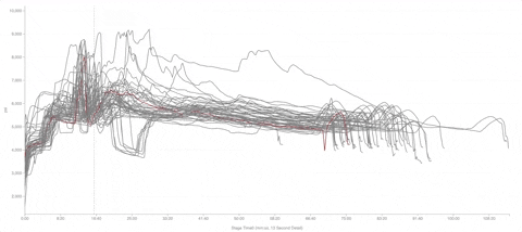
Nevertheless, complex data and insights can be tough to visualize. Include too much data and a chart becomes overwhelming; include too little and you don’t have enough context to actually draw a conclusion.
One secret to better charts? Use color more intentionally. Color can help you find outliers faster, draw attention to certain data sets or points, or make reams of data less cluttered or overwhelming. Uplevel your data viz in Well Data Labs with these simple color tricks:
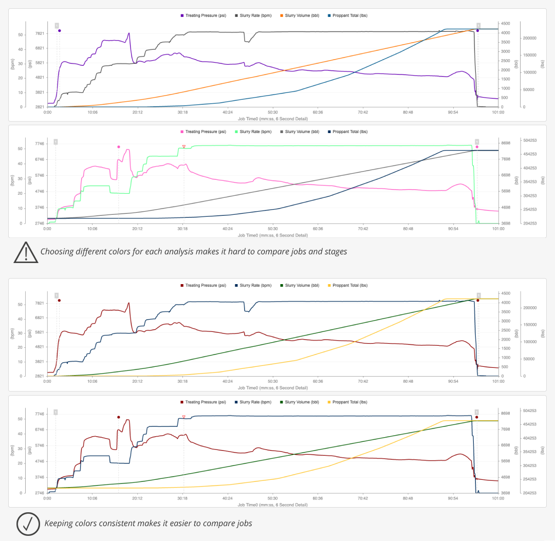
Keeping colors consistent can make it easier for your team to compare different treatment plots throughout the year. If colors change the meaning, it will be harder for you (and your audience) to quickly analyze a line chart.
Many of our power users tell us that they always use red for Treating Pressure, blue for Slurry Rate, and green for Slurry Volume when looking at treatment plots in Stage Mappings, Job Summary, or Multi-Well Timeline.
PRO TIP: Use chart templates to save your favorite channels.
If you find yourself often analyzing the same channels, create a Chart Template. Click the DATA button and then select “New Chart Template.” You can choose desired channels to save.
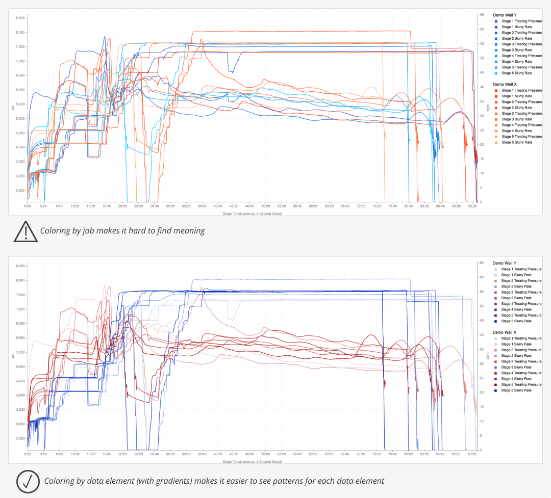
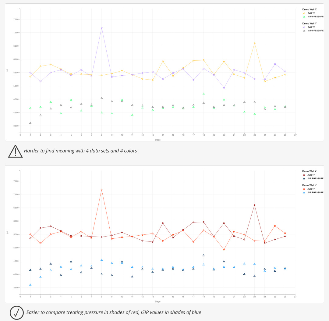
With lots of data channels, charts can get cluttered. Keep track of which channels belong to which jobs by using Stage Comparison’s “color by gradient” feature. By choosing “Gradient Min-Max” instead of “Flat,” you’ll be able to see earlier stages appear lighter and later stages appear darker. This is also an excellent trick to use before sharing the chart with others — the gradient colors make the chart less cluttered and easier for audiences to quickly interpret.
PRO TIP: When sharing your chart, don’t forget to turn on the chart legend. It will help your audience keep track of the different colors or shapes in your chart.
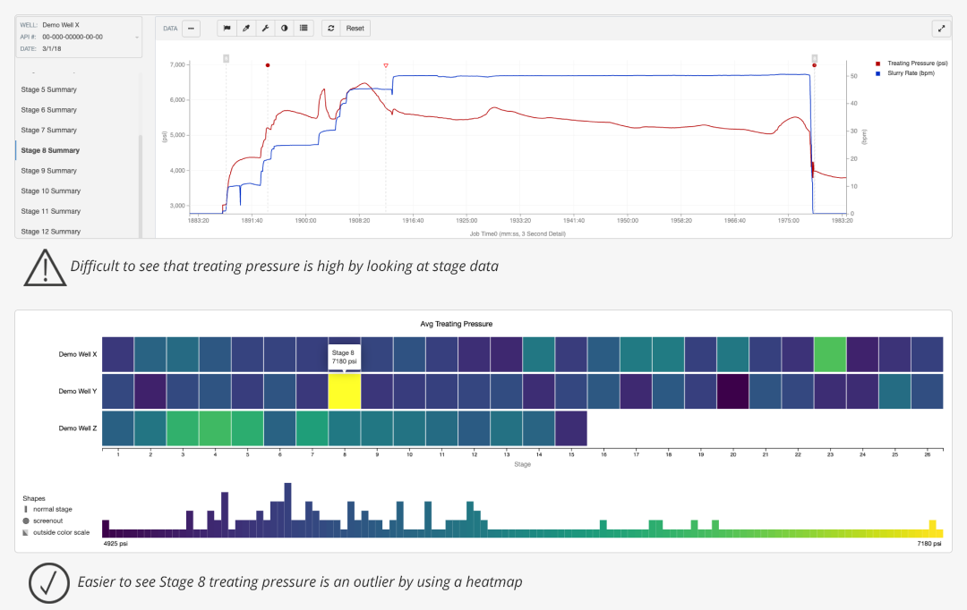
One of our most popular charts is Stage Variance because the purple-green-yellow color spectrum makes spotting abnormal behavior so easy. We hear many stories of customers catching “fat-fingered” data after looking at Stage Variance.
Suppose you’re presenting a chart to colleagues. In that case, you can use color to draw attention to unusual behavior on other charts, too. One of our favorite tricks is using Stage Comparison to look at abnormal behavior during a stage. To make an unusual stage stand out, we suggest picking a bright color (like red or blue) for the unusual stage and a muted color (like light blue or gray) for more normal stages.
PRO TIP: Double-clicking on a channel will make it bold and put it on “top” of the other stages. Simply double click to undo it. Check out the animation below.
Doing a more sophisticated analysis? Scatter Plot is an ideal option to see many data types at once. To assign unique colors to each element, go into Chart Colors and select “Data Element by Job.” We recommend using similar colors for data channels (example: shades of red for Treating Pressure) or similar colors for jobs (example: navy for Job 1 channels and light green for Job 2 channels.)
PRO TIP: On Scatter Plot, click once on a data point to draw a line that connects points in a data set.
If you’re planning to share a data visualization or chart with others, be sure your visualization is colorblind-friendly. It’s very possible some of your colleagues may have a color vision deficiency and will have trouble distinguishing between select colors.
Around 1 in 12 men have color vision deficiency, while a very small percentage of women also have color vision deficiency. This means that colors that appear different to other people look similar to those with a color vision deficiency. For example, people with deuteranopia or red-green color deficiency may report that greens and reds are hard to tell apart — both colors appear brownish.
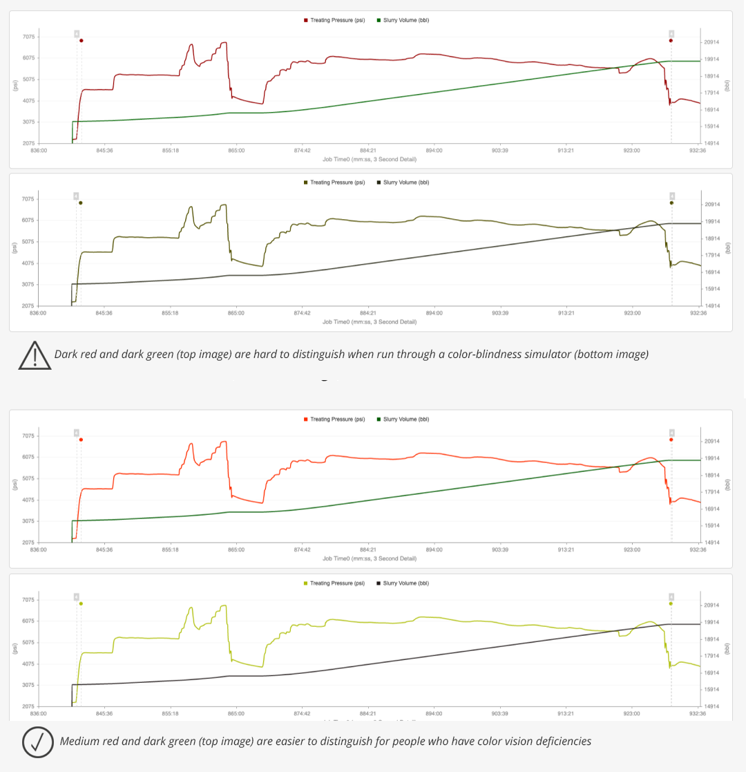
PRO TIP: For time series charts in WDL, try to avoid using reds, greens, and oranges together if you plan to present your chart to a wide audience of 10+ people. A better bet is to use either of the three colors paired with blue, as people with color vision deficiencies often don’t have a problem with blue.
If you must use any of those three colors together, there’s one trick to make your chart slightly more readable to folks with color vision deficiencies. You can use a very light color (light red, for example) paired with a darker one (dark green, for example). Someone with a color vision deficiency will be able to tell the dark data is different from the light data.
Want to see our machine learning-enabled data visualizations in action?
Contact sales@welldatalabs.com. Current customers are eligible for a free training session — schedule yours using this Calendly link or contact success@welldatalabs.com.